Empathy Mapping: The First Steps
Sarah Gibbons | Reading time: about 10 min
As UX professionals, it is our job to advocate on behalf of the user. However, in order to do it, not only must we deeply understand our users, but we must also help our colleagues understand them and prioritize their needs. Empathy maps, widely used throughout agile and design communities, are a powerful, fundamental tool for accomplishing both.
Definition: An empathy map is a collaborative visualization used to articulate what we know about a particular type of user. It externalizes knowledge about users in order to 1) create a shared understanding of user needs, and 2) aid in decision making.
This article is a guide to empathy mapping and its uses.
Format
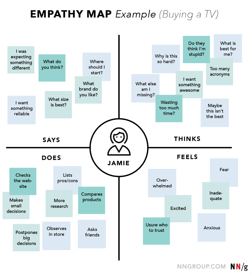
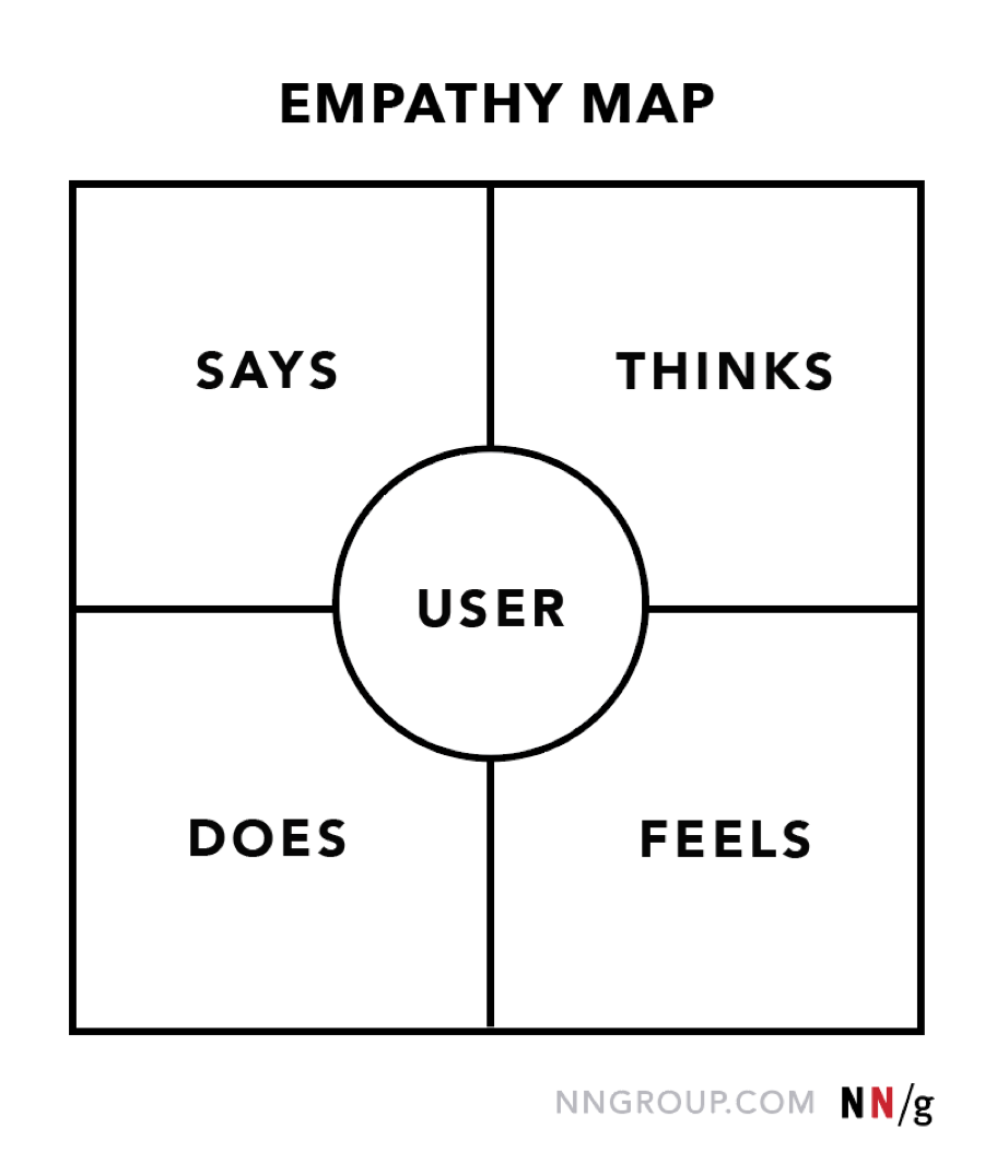
Traditional empathy maps are split into 4 quadrants (Says, Thinks, Does, and Feels), with the user or persona in the middle. Empathy maps provide a glance into who a user is as a whole and are not chronological or sequential.
The Says quadrant contains what the user says out loud in an interview or some other usability study. Ideally, it contains verbatim and direct quotes from research.
“I am allegiant to Delta because I never have a bad experience.”
“I want something reliable.”
“I don’t understand what to do from here.”
The Thinks quadrant captures what the user is thinking throughout the experience. Ask yourself (from the qualitative research gathered): what occupies the user’s thoughts? What matters to the user? It is possible to have the same content in both Says and Thinks. However, pay special attention to what users think, but may not be willing to vocalize. Try to understand why they are reluctant to share — are they unsure, self-conscious, polite, or afraid to tell others something?
“This is really annoying.”
“Am I dumb for not understanding this?”
The Does quadrant encloses the actions the user takes. From the research, what does the user physically do? How does the user go about doing it?
Refreshes page several times.
Shops around to compare prices.
The Feels quadrant is the user’s emotional state, often represented as an adjective plus a short sentence for context. Ask yourself: what worries the user? What does the user get excited about? How does the user feel about the experience?
Impatient: pages load too slowly
Confused: too many contradictory prices
Worried: they are doing something wrong
Be sure to keep empathy maps ‘alive’ by revising and adjusting them as you do more research.
Our users are complex humans. It is natural (and extremely beneficial) to see juxtaposition between quadrants. You will also encounter inconsistencies — for example, seemingly positive actions but negative quotes or emotions coming from the same user. This is when empathy maps become treasure maps that can uncover nuggets of understanding about our user. It is our job as UX professionals to investigate the cause of the conflict and resolve it.
Some of these quadrants may seem ambiguous or overlapping — for example, it may be difficult to distinguish between Thinks and Feels. Do not focus too much on being precise: if an item may fit into multiple quadrants, just pick one. The 4 quadrants exist only to push our knowledge about users and to ensure we don’t leave out any important dimension. (If you don’t have anything to put into a certain quadrant, it’s a strong signal that you need more user research before proceeding in the design process.)
One User vs. Multiple-Users Empathy Maps
Empathy mapping can be driven by any method of qualitative research (and can be sketched even if research is lacking). They can help UX professionals understand what aspects of their user they know and where they would need to gather more user data.
Empathy maps can capture one particular user or can reflect an aggregation of multiple users:
One-user (individual) empathy maps are usually based on a user interview or a user’s log from a diary study.
Aggregated empathy maps represent a user segment, rather than one particular user. They are usually created by combining multiple individual empathy maps from users who exhibit similar behaviors and can be grouped into one segment. The aggregated empathy map synthesizes themes seen throughout that user group and can be a first step in the creation of personas. (However, empathy maps are not a replacement for personas. But they can be one way to visualize what we know about a persona in an organized, empathetic way.)
Aggregated empathy maps can also become ways to summarize other qualitative data like surveys and field studies. For example, an empathy map can be used to communicate a persona, instead of the traditional ‘business card’ approach. As more research is gathered about that persona, you can circle back to the empathy map and add new insights or remove those that have changed or been invalidated.
Why Use Empathy Maps
Empathy maps should be used throughout any UX process to establish common ground among team members and to understand and prioritize user needs. In user-centered design, empathy maps are best used from the very beginning of the design process.
Both the process of making an empathy map and the finished artifact have important benefits for the organization:
Capture who a user or persona is. The empathy-mapping process helps distill and categorize your knowledge of the user into one place. It can be used to:
Categorize and make sense of qualitative research (research notes, survey answers, user-interview transcripts)
Discover gaps in your current knowledge and identify the types of research needed to address it. A sparse empathy map indicates that more research needs to be done.
Create personas by aligning and grouping empathy maps covering individual users
Communicate a user or persona to others: An empathy map is a quick, digestible way to illustrate user attitudes and behaviors. Once created, it should act as a source of truth throughout a project and protect it from bias or unfounded assumptions.
Collect data directly from the user. When empathy maps are filled in directly by users, they can act as a secondary data source and represent a starting point for a summary of the user session. Moreover, the interviewer may glean feelings and thoughts from the interviewee that otherwise would have remained hidden.
Process: How to Build an Empathy Map
Go through the following steps to create a valid and useful empathy map:
1. Define scope and goals
a. What user or persona will you map? Will you map a persona or an individual user? Always start with a 1:1 mapping (1 user/persona per empathy map). This means that, if you have multiple personas, there should be an empathy map for each.
b. Define your primary purpose for empathy mapping. Is it to align the team on your user? If so, be sure everyone is present during the empathy-mapping activity. Is it to analyze an interview transcript? If so, set a clear scope and timebox your effort to ensure you have time to map multiple user interviews.
2. Gather materials
Your purpose should dictate the medium you use to create an empathy map. If you will be working with an entire team, have a large whiteboard, sticky notes, and markers readily available. (The outcome will look somewhat like the illustration above.) If empathy mapping alone, create a system that works for you. The easier to share out with the rest of the team, the better.
3. Collect research
Gather the research you will be using to fuel your empathy map. Empathy mapping is a qualitative method, so you will need qualitative inputs: user interviews, field studies, diary studies, listening sessions, or qualitative surveys.
4. Individually generate sticky notes for each quadrant
Once you have research inputs, you can proceed to mapping as a team. In the beginning, everybody should read through the research individually. As each team member digests the data, they can fill out sticky notes that align to the four quadrants. Next, team members can add their notes to the map on the whiteboard.
5. Converge to cluster and synthesize
In this step, the team moves through the stickies on the board collaboratively and clusters similar notes that belong to the same quadrant. Name your clusters with themes that represent each group (for example, “validation from others” or “research”). Repeat themes in each quadrant if necessary. The activity of clustering facilitates discussion and alignment — the goal being to arrive at a shared understanding of your user by all team members.
Once your empathy map is clustered, you can begin to vocalize and align as a team on your findings. What outliers (or data points that did not fit in any cluster) are there? What themes were repeated in all the quadrants? What themes only exist in one quadrant? What gaps exist in our understanding?
6. Polish and plan
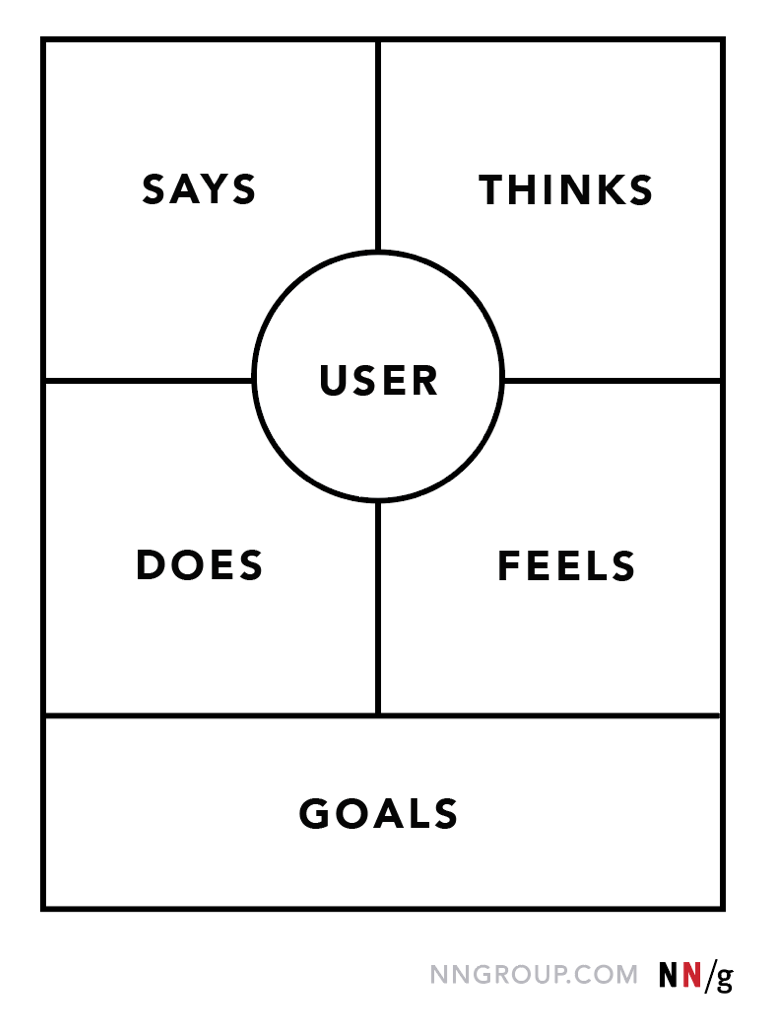
If you feel that you need more detail or you have unique needs, adapt the map by including additional quadrants (like Goals the example below) or by increasing specificity to existing quadrants. Depending on the purpose of your empathy map, polish and digitize the output accordingly. Be sure to include the user, any outstanding questions, the date and version number. Plan to circle back to the empathy map as more research is gathered or to guide UX decisions.
Conclusion
As their name suggests, empathy maps simply help us build empathy with our end users. When based on real data and when combined with other mapping methods, they can:
Remove bias from our designs and align the team on a single, shared understanding of the user
Discover weaknesses in our research
Uncover user needs that the user themselves may not even be aware of
Understand what drives users’ behaviors
Guide us towards meaningful innovation
Learn and practice empathy mapping in our full-day course Generating Big Ideas with Design Thinking.
Summary: Visualizing user attitudes and behaviors in an empathy map helps UX teams align on a deep understanding of end users. The mapping process also reveals any holes in existing user data. First published 14 January 2018
By Sarah Gibbons: Ms. Gibbons is Nielsen Norman Group's Chief Designer. She works at the intersection of design research, strategy, and user experience design.
 ISG Playbook
 APIs
APIs


